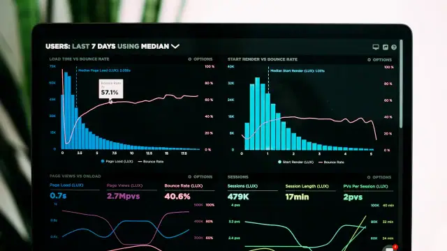

Imagine a fictional craft shop with a small WooCommerce catalogue. The owner sees abandoned carts but has no reliable evidence about the reason. Some visitors browse casually, while others may meet an unclear shipping charge or a difficult form. The following review separates observable friction from assumptions and does not claim a measured sales improvement.
Walk through the whole purchase
Start from a product page rather than opening checkout directly. Review options, stock messages, price, and the route to the cart. A problem earlier in the journey can look like checkout abandonment in a summary report. Use a test environment and an approved test payment method so the exercise does not charge a real customer or consume genuine stock.
Put it into practice
Complete a representative purchase from product selection to confirmation using test data.
Evidence to keep: A task log identifying the page and decision at each step.
Stop and investigate if: The review starts at checkout and ignores confusing product options or cart behaviour.
Keep the initial observation separate from the proposed solution. Write down what was known before making the change, which part of the exercise is hypothetical, and which information must come from the real website owner. This prevents an attractive explanation from becoming an unsupported claim. Ask a second reader to identify the decision being made and the condition that would change it.
Reveal the total before commitment
Visitors need to understand the amount they are about to pay and what it includes. Explain delivery conditions, applicable charges, and any uncertainty before the final action. Do not bury a material condition behind an ambiguous link. If a cost depends on an address or destination, make that dependency understandable rather than presenting a misleadingly complete earlier total.
Put it into practice
Check when each cost becomes visible and whether the final amount is clearly explained.
Evidence to keep: A sequence showing product price, delivery calculation, and final total.
Stop and investigate if: A significant charge appears only after the visitor has invested unnecessary effort.
Use a comparison that another authorised person could repeat. Keep the relevant conditions stable, record the version or document reviewed, and change only what the question requires. If a comparison cannot isolate the cause, describe it as an observation rather than a proof. The useful record explains what was checked, what remained outside the test, and what should be investigated next.
Keep fields relevant to fulfilment
Ask for information the order requires and explain unusual requests. A digital product and a shipped object do not necessarily need the same details. Consider whether account creation is necessary for the particular offer. Avoid deleting fields blindly, because tax, delivery, and payment arrangements may depend on them. Review the actual workflow rather than copying a generic minimalist design.
Put it into practice
Justify every required field against fulfilment, communication, or another stated purpose.
Evidence to keep: A checkout field inventory and the purpose of each required value.
Stop and investigate if: The form requests information that nobody can connect to completing the order.
Make the verification artefact small enough to review carefully. A short note, a safe test submission, or a documented configuration comparison can be more useful than a large unexplained report. Keep private information out of public examples. When the evidence is incomplete, state the gap beside the decision instead of allowing a confident summary to conceal the unresolved part of the work.
Check mobile input and error recovery
A keyboard can cover a button, a narrow dropdown can be hard to operate, and a payment error can erase progress. Test the page on a phone with a deliberately incorrect entry. Labels and helpful errors matter more than decorative polish. Keep the selected products and valid information when the visitor corrects a mistake.
Put it into practice
Run a mobile checkout with one intentional error and recover without restarting.
Evidence to keep: A documented error path showing what information was retained.
Stop and investigate if: An ordinary error clears the cart or prevents the visitor from correcting the field.
Before accepting this step, consider the ordinary failure path as well as the successful one. Identify who notices a problem, what the visitor sees, and how the team returns to a known state. A process that works only when every assumption is correct remains fragile. The recovery action should be understandable to someone who did not design the original change.
Explain the payment handoff
A payment provider may open another page or return the visitor after authentication. Explain what happens next and test both success and cancellation in the provider’s test mode. Never store payment credentials in a public document or improvised form. The website should make the outcome understandable even when the visitor decides not to complete the payment.
Put it into practice
Test successful, cancelled, and failed payment outcomes using the approved sandbox.
Evidence to keep: A result record matching the visible message to the test order state.
Stop and investigate if: A cancelled payment is shown as paid or a successful payment leaves an unclear order state.
Check the result in the context where it will actually be used. An isolated editor view, a demonstration account, or an unusually fast device may hide a difficulty that matters in normal operation. Record any conditions that differ from the intended audience. This does not require pretending to test every possible situation; it requires a clear account of the situations that were and were not examined.
Confirm the order consistently
The confirmation page, order record, and customer email should agree about the product and next step. Check that the responsible team can see the order and fulfil it. A confirmation that promises dispatch or delivery should reflect the shop’s real process. Do not announce a service level the business cannot reliably provide just because a template includes it.
Put it into practice
Compare one test order across the confirmation page, order system, and email.
Evidence to keep: A reconciliation note for the same test order identifier.
Stop and investigate if: The customer and shop receive conflicting information about the transaction.
Give the decision an owner and a review trigger. The person approving a change should know what evidence supports it and what would justify reopening it. Keep the handover practical: describe the action, the expected observation, and the limit of the conclusion. If responsibility is shared, explain where the next step goes rather than leaving it somewhere between several people.
Investigate abandonment with limits
An unfinished cart is not automatically a technical failure. Visitors compare options, postpone decisions, or explore delivery costs. Combine technical tests with appropriately collected feedback and clearly defined analytics. Small samples and incomplete consent can limit what a report represents. State those limits before claiming a particular design choice explains every departure.
Put it into practice
Separate observed errors from hypotheses about visitor motivation.
Evidence to keep: A short issue list distinguishing evidence, interpretation, and unanswered questions.
Stop and investigate if: The team treats a correlation or one comment as a universal explanation.
Avoid turning a useful local finding into a universal rule. A result can depend on content, configuration, staffing, timing, or the audience’s needs. Note those dependencies in the review. A good recommendation remains conditional where the evidence is conditional, and it distinguishes a sensible next experiment from a result that has already been established by a controlled observation.
Change one meaningful thing at a time
Start with the clearest verified obstacle and define what would count as improvement. Keep the rest of the journey stable enough to interpret the comparison. Test accessibility and order correctness after the change. A new plugin adds another dependency, so compare its benefit with the work required to maintain and recover it.
Put it into practice
Implement one reviewed correction and repeat the same purchase acceptance tests.
Evidence to keep: A change log and an outcome review with a stated observation period.
Stop and investigate if: Several unrelated changes make it impossible to identify what helped or harmed the process.
Finish this check with a record another maintainer can understand later. Include the reason for the decision and any unfinished action, not just a mark saying complete. Revisit the check when its assumptions change. Keeping that link between a decision and its evidence makes future updates easier and prevents an old instruction from surviving after the situation it described has disappeared.
Worked example: a fictional scenario with concrete decisions
In the fictional craft shop, choose one physical product with a selectable size and a delivery destination. The tester starts on the product page, selects a valid option, and adds it to the cart. A note records whether the selected size and quantity remain visible. Starting here matters because an unclear product choice can cause uncertainty that appears later as an unfinished checkout. The test uses a sandbox and fictional details; no customer is charged and no real order is represented as evidence.
The tester follows the delivery calculation and checks when its cost becomes known. If the cost depends on the destination, the page should explain that dependency. A preliminary figure must not imply that all costs are final. The review also checks whether the shop’s delivery description is understandable before the final payment action. An accurate explanation may be more valuable than a visually prominent discount whose conditions appear only in a separate document.
Next, introduce an ordinary input error, such as an incomplete email address. Observe whether the field is identified, the message explains the problem, and the valid address and product information remain. Repeat on a phone with the keyboard open. A successful desktop purchase does not cover that interaction. The tester records what happened rather than assuming every customer with an unfinished cart encountered the same issue. Different visitors can leave for entirely different reasons.
The payment test covers three outcomes: a successful test transaction, a deliberate cancellation, and a simulated failure supported by the provider’s test environment. Compare each outcome with the shop’s order state and the message shown to the visitor. A cancellation must not become a paid order, while a successful payment needs an intelligible confirmation. If an external authentication step is involved, include the return journey. The checkout is a sequence across systems, not merely the appearance of the final button.
The team fixes the clearest observed problem and repeats the same acceptance sequence. It then plans a separate review of appropriately collected data over a stated period, recognising sample size and other changes. A new checkout plugin is considered only if it solves a defined requirement that the existing setup cannot meet reliably. This exercise demonstrates how to investigate and verify. It does not establish a sales uplift, identify a universal cause of abandonment, or recommend collecting more visitor data than the shop actually needs.